Golootlo: Helping the brand launch new features and campaigns faster through a full revamp
8 min read•2025
Golootlo is a consumer app built around discounts and deals from some of Pakistan’s
best known brands, including J., KFC and PIA.
7 years brought a lot of change to Golootlo, but the experience stayed the same. It
started to feel dated and flat. As we added more
brands and features, the structure became harder to scale, and that started showing in
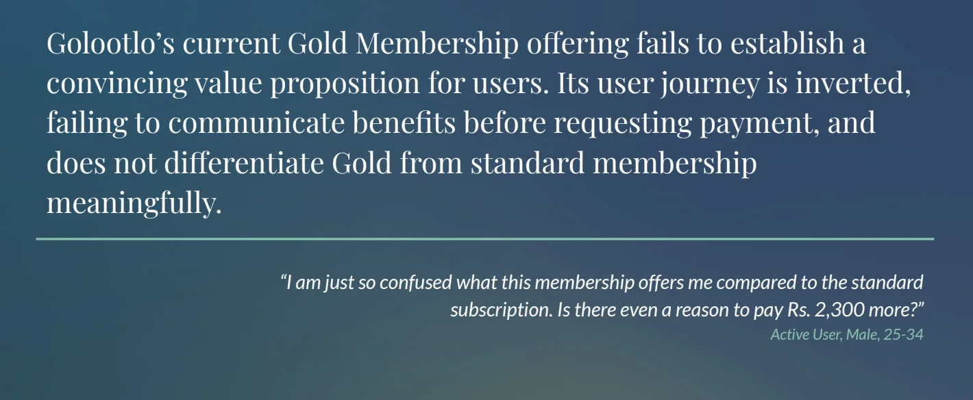
the experience. We noticed that Gold Membership struggled to
convert, while the delivery and ecommerce vertical saw
lower engagement than our in store deals.
It became clear that these were signs of a bigger problem and small fixes would not be
enough. The product needed a complete revamp.
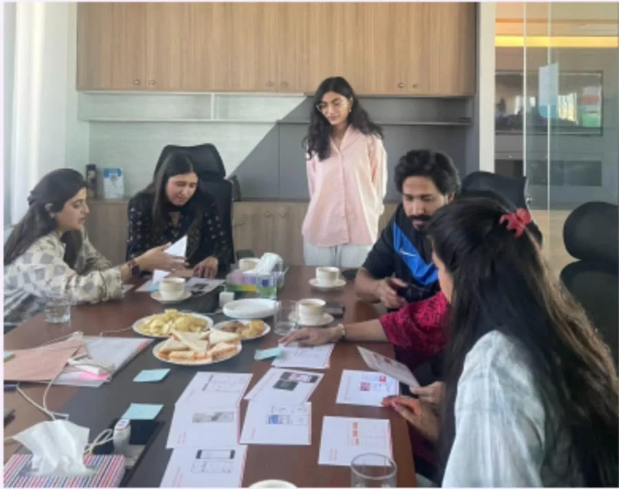
Primary Research (Interviews and Focus Group)
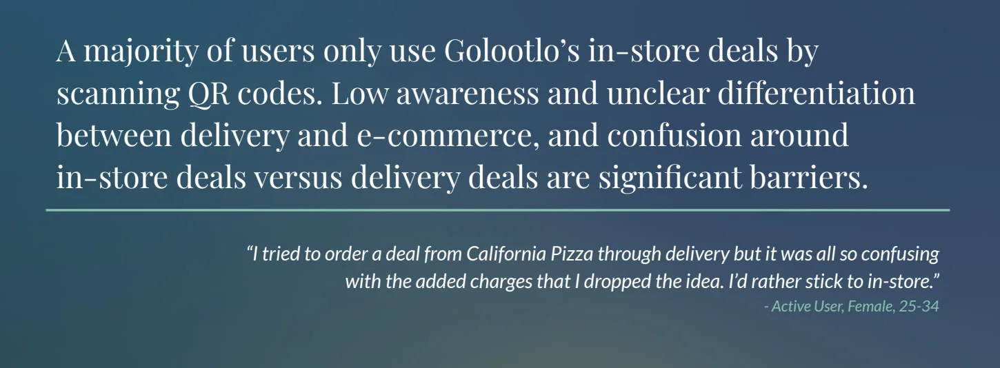
We knew the app had problems, but we did not know exactly where they were coming from.
There were too many possible reasons, and we did not want to base the revamp on
assumptions.
So we started with the data.
We looked at our own analytics using tools like Google Analytics and Microsoft Clarity
to understand how people were actually using the app. We looked at daily active users,
downloads, retention, and where people were dropping off. The numbers confirmed that
something was not working as it should.
But the data could tell us what was happening, not why.
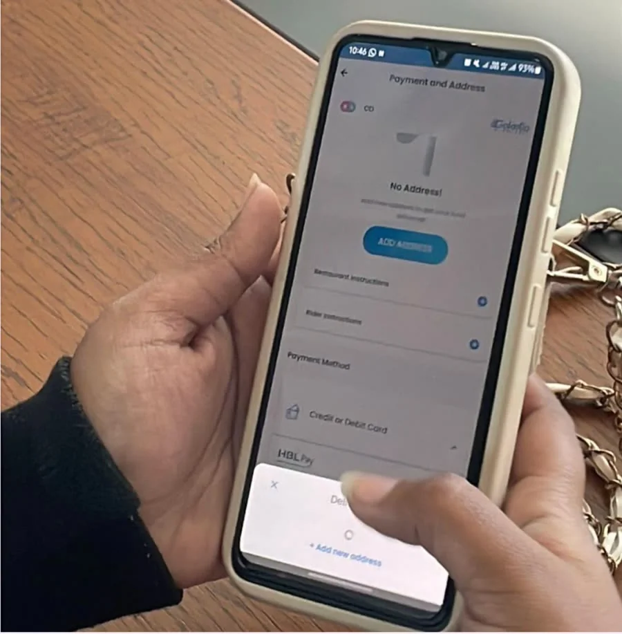
That took us to our users. We spoke to active, inactive, and dropped off users through
individual interviews and focus group discussions.
Secondary Research (UX Audit)
By this point, we had a clearer picture of what was going wrong. The data showed us
where users were struggling, and our conversations with users helped us understand why.
Now, we needed to look at the product itself.
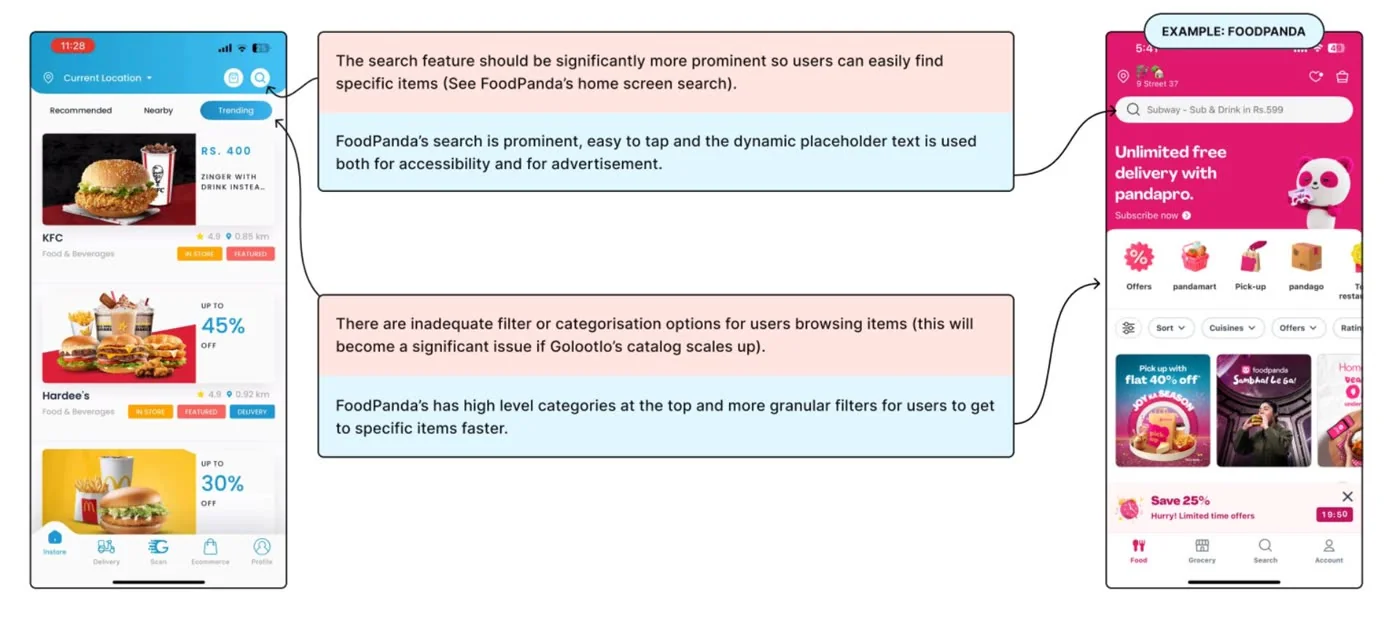
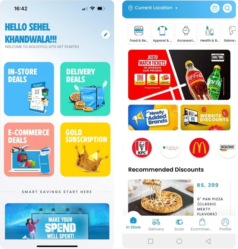
We ran a UX audit using Nielsen’s usability heuristics and compared Golootlo with
similar products to identify gaps in the experience.
Once we had all the issues mapped out, we prioritized them based on their impact on the
user experience.
For this case study, we are focusing on two of those priorities:
Navigation and
Gold Membership. The rest of the case study looks
at how we tackled these two problems and improved the experience.
Navigation
Gold Membership
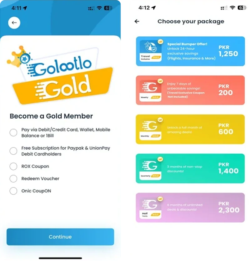
Competitor Analysis
Alongside our own research, we looked at how competing deals and rewards apps solved the
same problems — where their flows felt stronger than ours, and where we saw room to do
better rather than just catch up.
[placeholder — competitor 1 summary to be added]
[placeholder — competitor 2 summary to be added]
Problem Statement
This is a simple summary of the key problems we found and the direction we needed to
take.
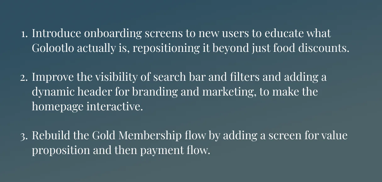
Ideation
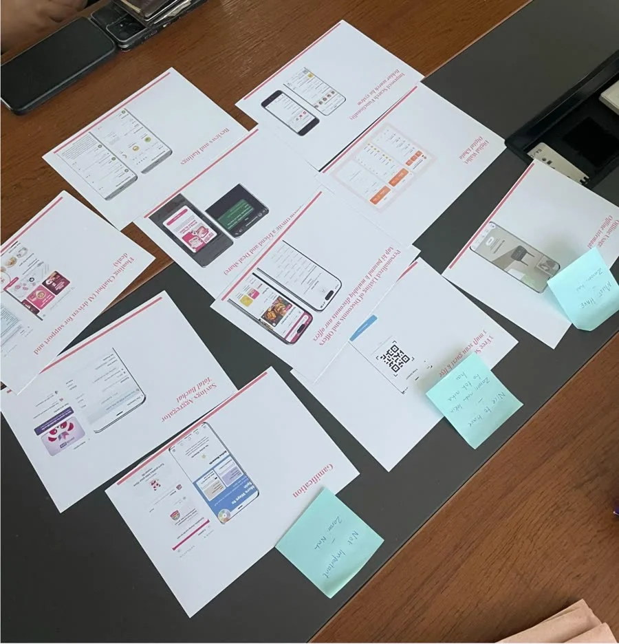
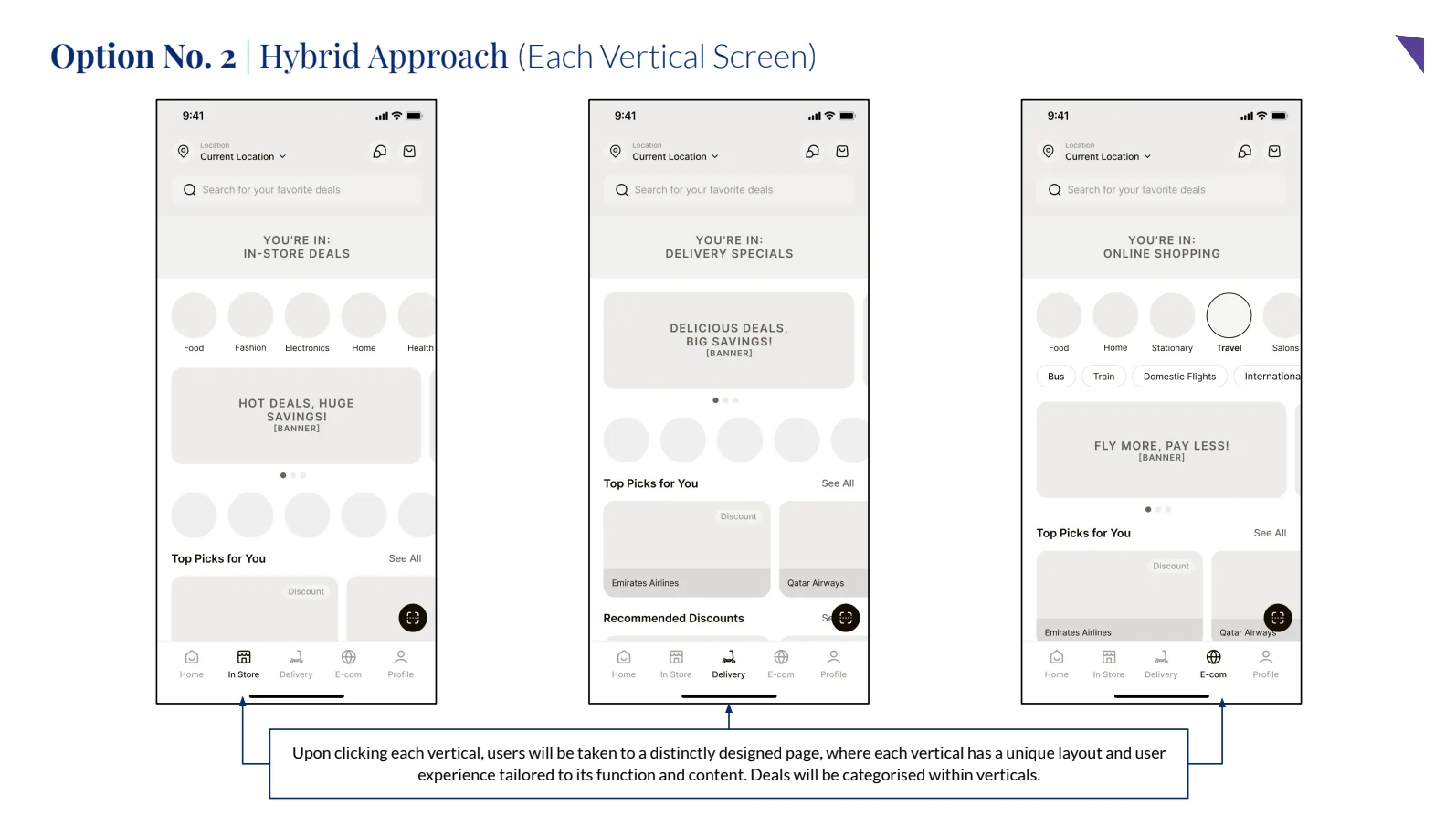
From the problem statements, we identified the areas we needed to work on. We chose
these solutions based on the team’s workload, product and business goals.
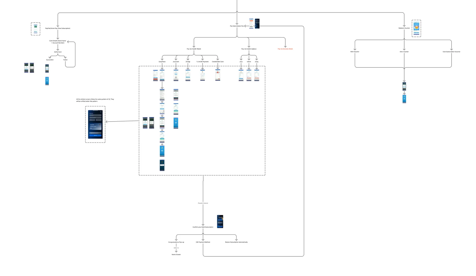
User Flows & Wireframes
We first mapped the user flows to understand where we could reduce friction and improve
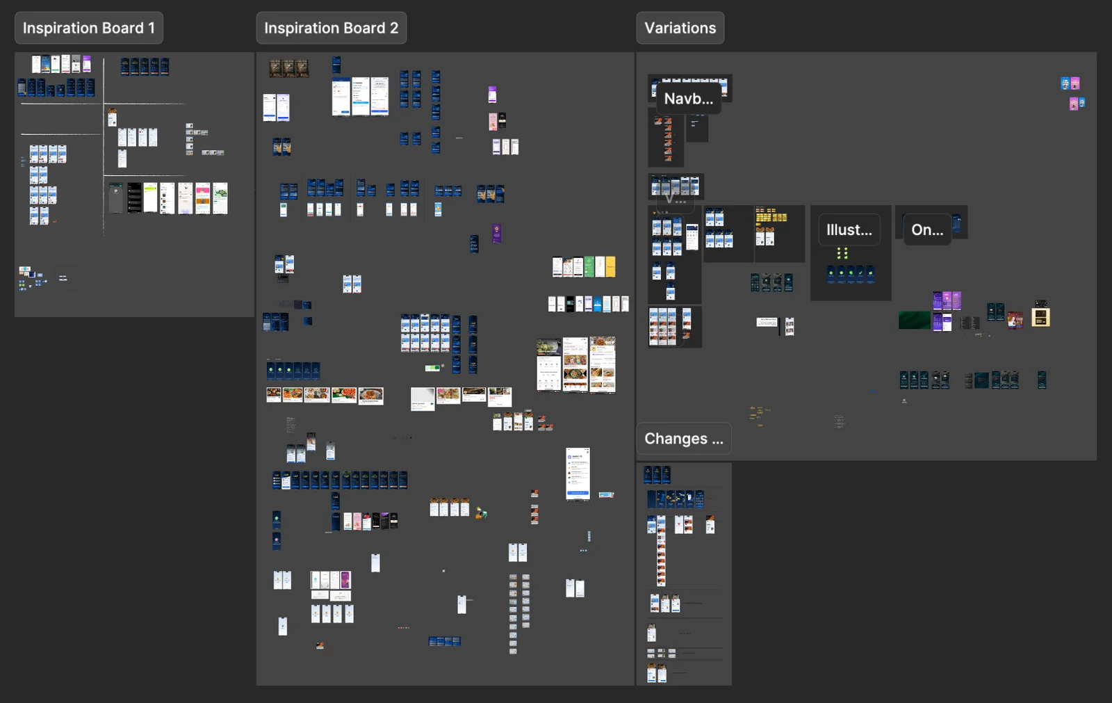
the experience. Once the flow were approved, we explored wireframe layouts &
inspirations from Mobbin to see how similar problems were being solved by our
competitors.
Building the Design System
Since we never had maintained design file system to build on, everything had to start
from scratch.
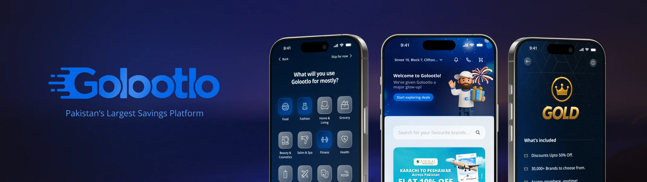
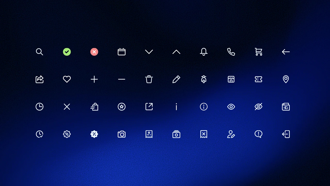
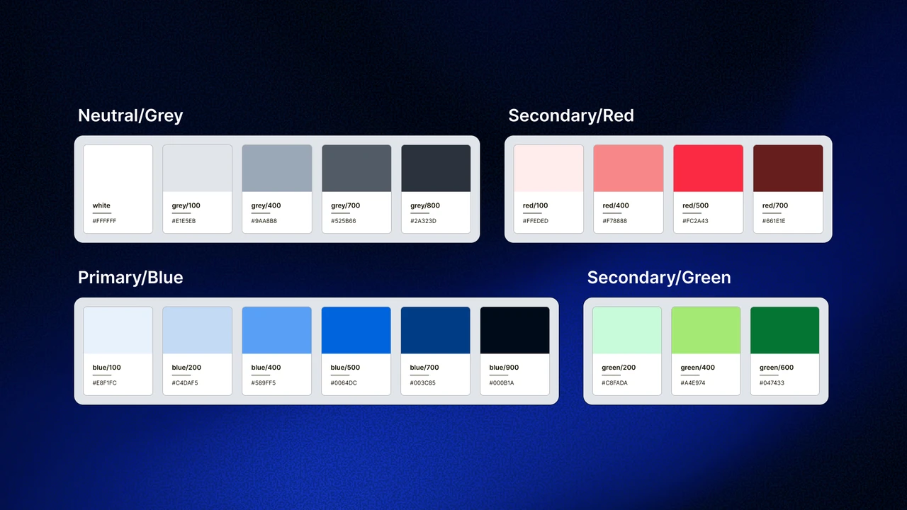
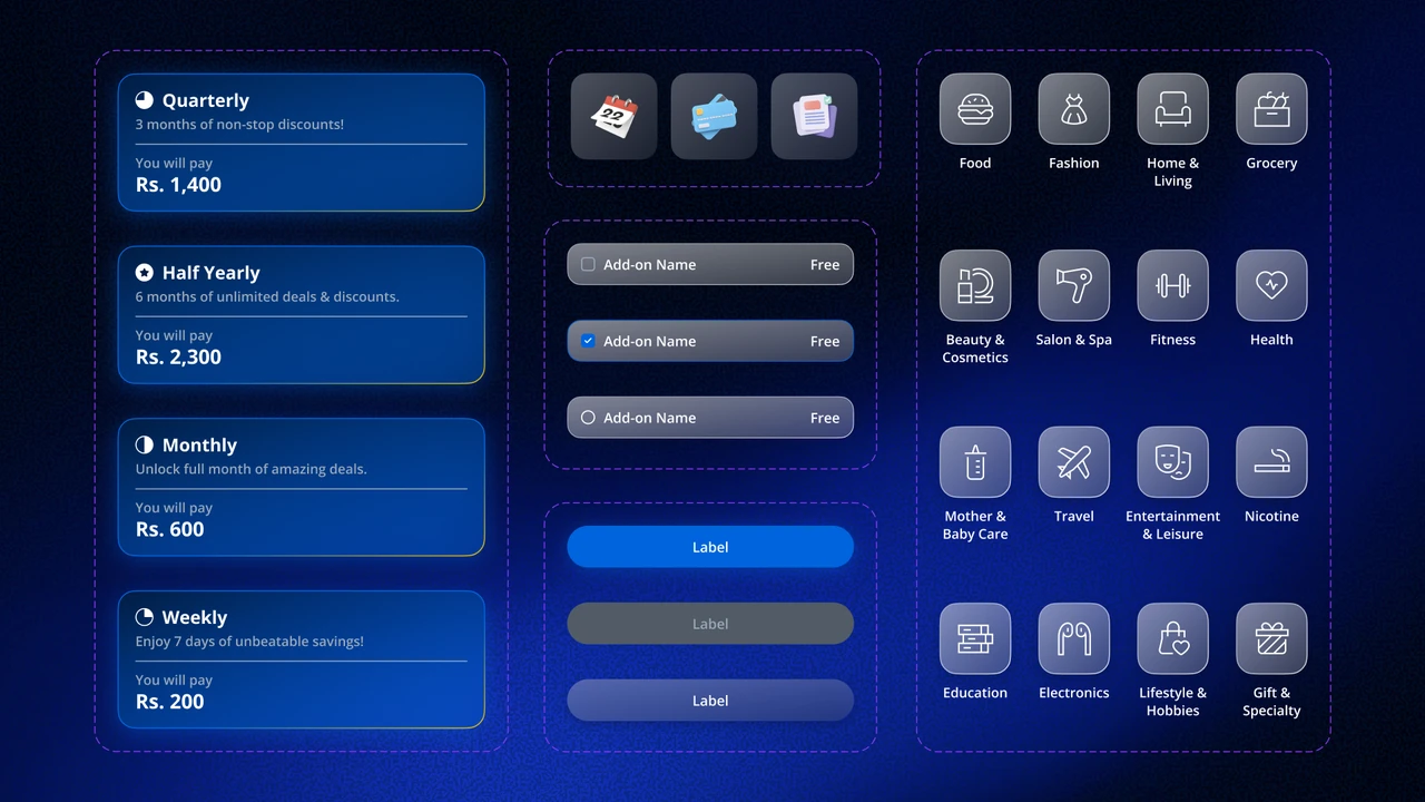
We built a new design system covering colours, typography, components, and assets. The
inspiration we chose was Apple’s Liquid Glass to attract more GenZ.
The product team created everything in house, from assets to Lottie animations, with AI
used to write microcopies and design assets for bringing in a distinctly Pakistani feel
and reflecting local culture.
Design & Prototype
After multiple rounds of iteration and feedback from stakeholders, Product &
Operations, we refined the screens together for over a month before they were ready
for handoff.
PS: Sorry for the bad quality
Improvements:
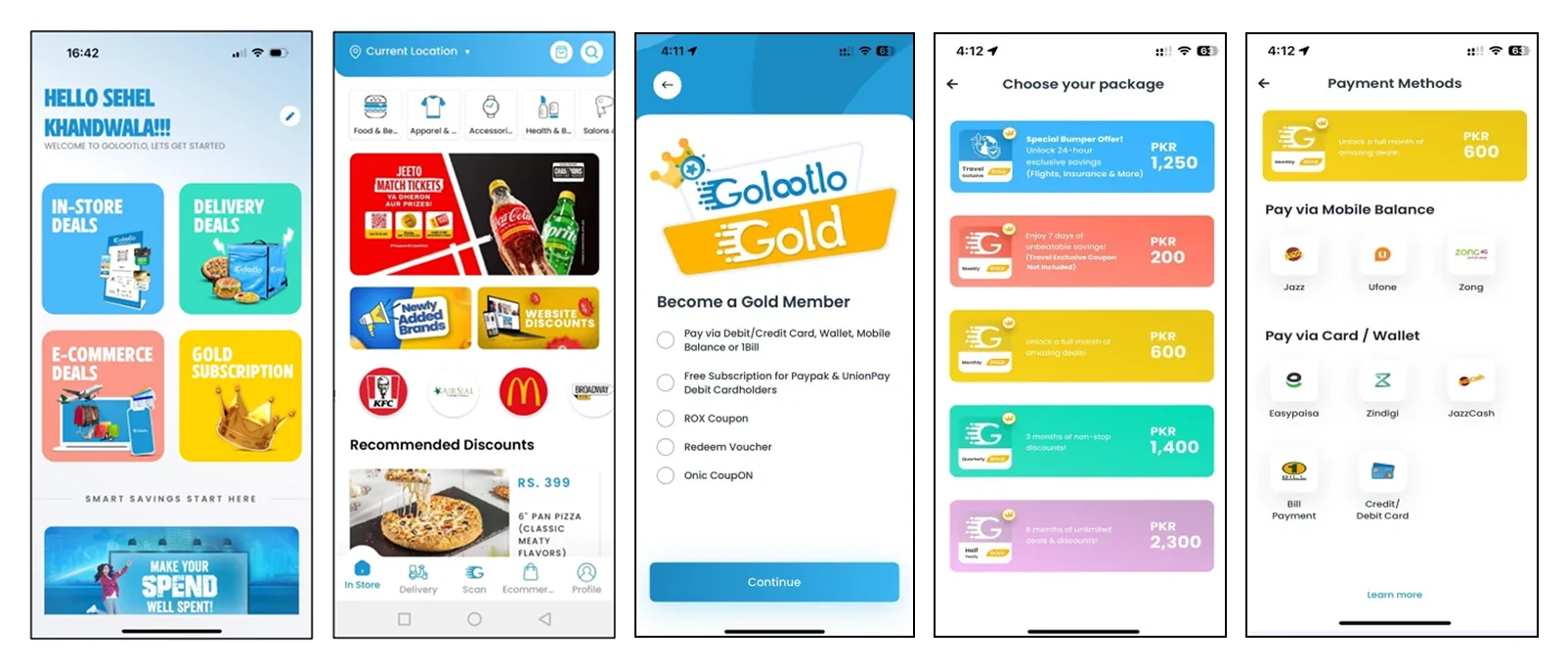
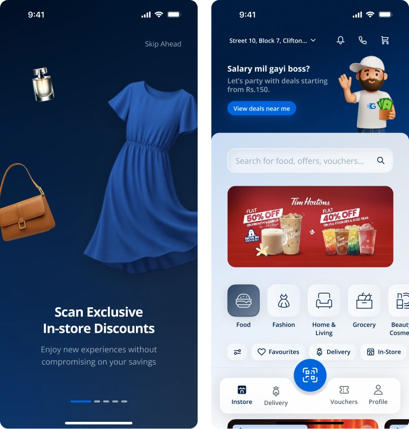
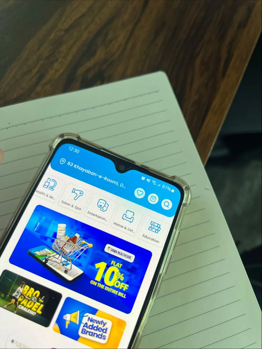
We introduced three onboarding screens to help users understand the app before they start exploring it.
Introduced a dynamic header for promotions and campaigns.
Moved Search to the top as a primary action.
PS: Sorry for the bad quality
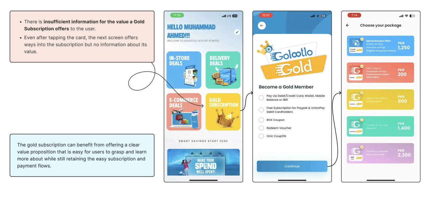
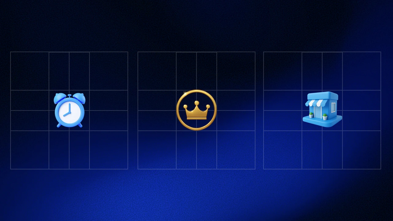
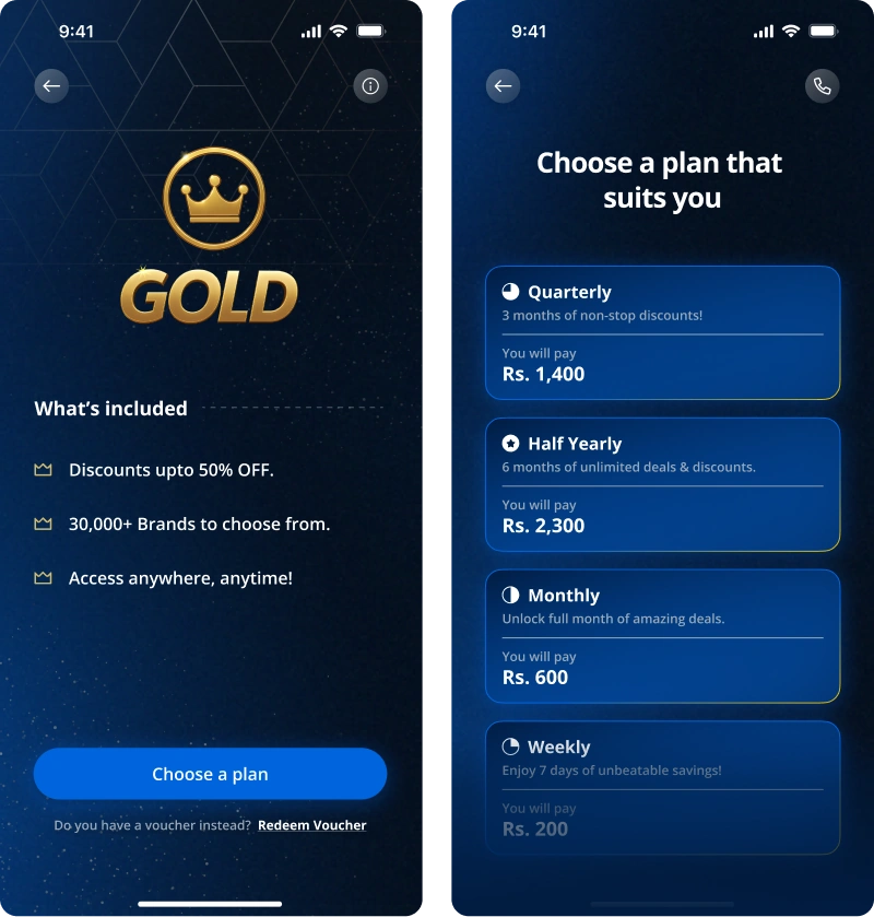
For Gold Membership, we completely redesigned the experience, including a new
emblem created in house.
Instead of focusing only on payment, the new flow focuses on showing users the
value they get from Gold. The goal was to make the benefits clear before asking
users to subscribe.
Improvements:
Updated the gold emblem and flow to focus on showing users the value they get from Gold.
Usability Testing & Handoff
Once the designs were ready, we handed them off to Development. While the team worked
on the build, we continued working on the Phase 2. Dynamic Search.
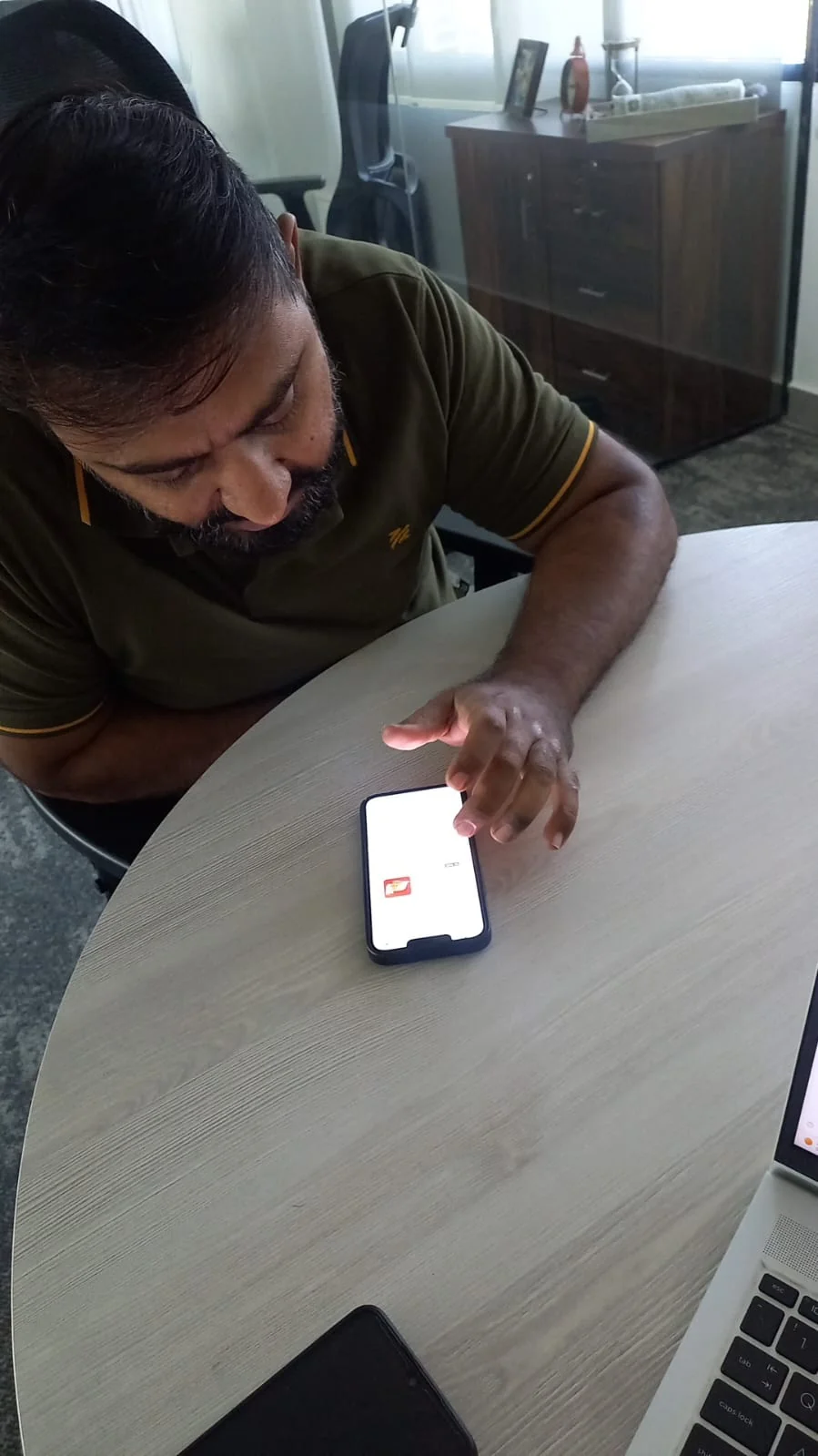
After the build was ready, we started QA and usability testing with our team and
selected users. Their feedback helped us identify a few more changes like
accessibility, interactions & microcopy enhancements.
Launch & Impact
On October 22, 2025, the revamp build was released but in
phases.
We split the Phase 1 into two builds, with the first being an UX focused build on
fixing the areas causing the most friction for users and UI polishing for later.
Before: [placeholder — pre-launch metrics to be added]
After: [placeholder — post-launch metrics to be added]
Behind the Scenes
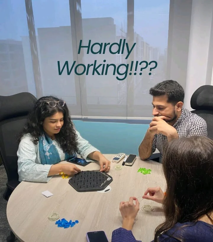
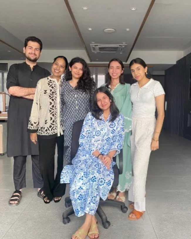
At last, I would just say that the great products you see in your hands is not just a
marvel of design or engineering. It carries the chemistry and teamwork of the people
who built it together.