

PureVPN: Improving the Data Removal Feature for Max and Standard Users
PureVPN's Max plan ships with a "Remove My Data" feature that helps users scrub personal information from public search sites and data brokers, but activation was low among Max subscribers and the feature wasn't compelling enough to drive Standard users to upgrade. This case study walks through how I rethought the flow to make the value obvious, timely, and emotionally resonant.
Design Process
-
Challenge
-
Gather Data
-
Moodboard
-
Define
-
Design & Prototype
Challenge
PureVPN's Max plan includes a Data Removal feature ("Remove My Data") designed to help users remove personal information from public search sites / data brokers. However:
- Max users rarely activate Data Removal, even after purchasing a Max plan.
- Standard users don't upgrade to Max because the value of Data Removal is unclear, not timely, or not compelling in the current experience.
My goal was to improve Data Removal Feature Activation for Max users and upgrade intent / conversion for Standard users, while maintaining a smooth experience for existing VPN features.
Gather Data
1. I started with using the Data Removal feature on both Standard and Max subscriptions. With that I sketched a basic flow of how the journey is.
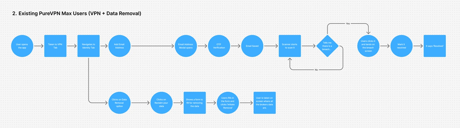
2. After testing the journey several times and mapping the flow, I researched how users perceive similar features on other platforms, including user feedback and available stats.
Existing PureVPN Standard Users (VPN-only)
- Due to the name of our app, most users think it's only a VPN, so we need to clearly show everywhere that it does more than that.
- On the , the Data Removal feature comes at the end of the carousel, and many users don't scroll far enough to ever see it. So everything needs to be on the same page.
- Data Removal should show up naturally , alongside things like VPN and password security, so users see it as equally important. Short, emotional prompts can help users feel safer and more confident, like knowing their personal data is being removed from the internet for them.
Existing PureVPN Max Users (VPN + Data Removal)
- In the , new users don't know where to start or what to do first. It doesn't guide them clearly. Data discovery and data removal feel like two separate features, even though a lot of times users expect them to work together. The flow feels broken; users aren't taken step by step from entering their personal details to discovering where that data is publicly available.
- The word "Brokers" is confusing, and users don't clearly understand who has their personal data. "Sites" could be a better word.
- There's too much happening on the at once; users need a simpler, step-by-step experience that also explains why this matters.
Moodboards
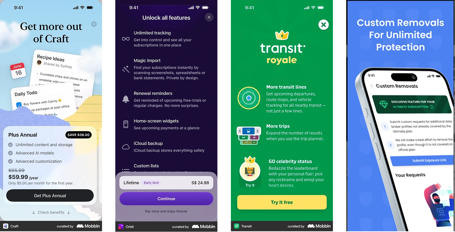
- While identifying the issues in the flow, I did a qualitative research involving images from resources like Mobbin.
-
Through this activity, I noticed three patterns for our problems to be potentially resolved.
- Subscription Modals: A lot of platforms use a list-based subscription page, in order for users to get a gist of the premium in one glance.
- Data Removal Feature: Most of the platforms nowadays use a step-by-step, CTA-based approach in interfaces in order to guide their users to discover a new / different patterned features.
- Feature Education: Apps are using modals / banners throughout their app to promote their core and premium features.
Note: By "different patterns" I mean apps that have a feature or flow that is uncommon.
Define
- We need to clearly show short, emotional prompts / banners throughout our App that will educate users about our "Data Removal" feature.
- Subscription page needs to be updated. Use a list-based screen instead of carousel.
-
Improve the content hierarchy of the Data Removal Section, which enables a step-by-step approach to navigate the sections (Dark Web Monitoring and Data Removal).
- As a technical limitation, we can avoid linking them together, but we can at least prompt the user to use this feature, once he adds his assets in the Dark Web Monitoring flow. In simple words, adding an entry point.
This strategy aims to reduce the drop-off rate on the Data Removal section and improve the conversion from Standard to Max plan.
Design & Prototype
Banner / prompts throughout the app to surface Data Removal.
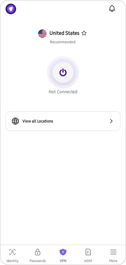
Before
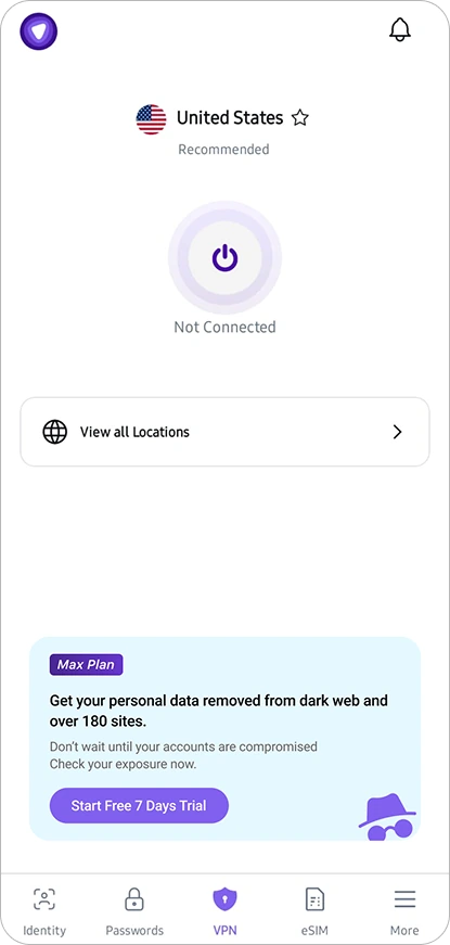
After
List-based subscription page that surfaces the full Max value at a glance.
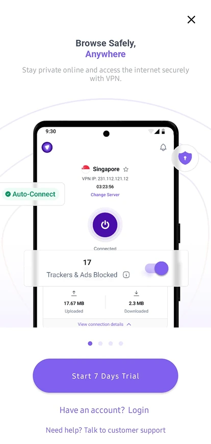
Before
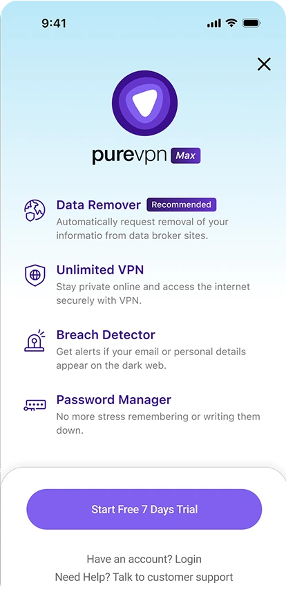
After
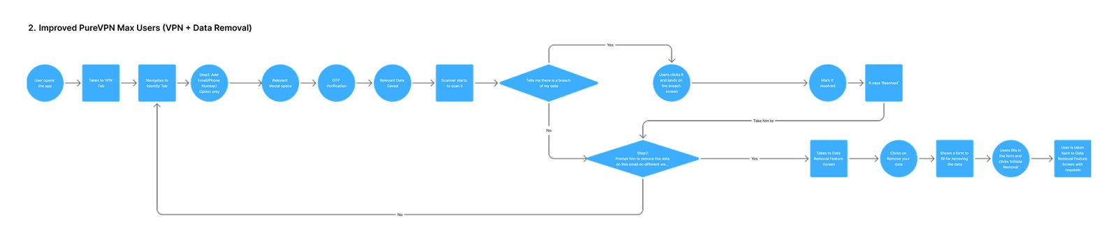
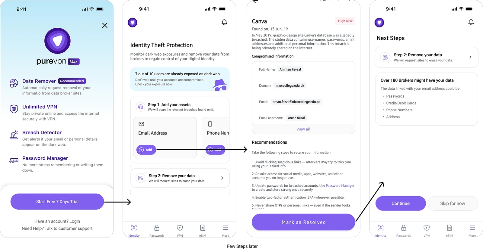
Reworked end-to-end user flow (Max).
Identity Theft Protection. Restructured into a clearer, step-by-step layout.
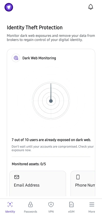
Before
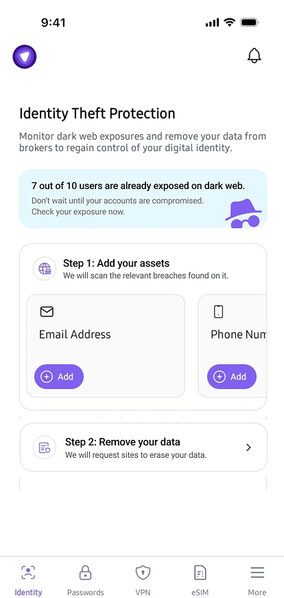
After
End-to-end journey from subscription to resolved breach.
Impact
These fixes aim to increase the conversion rate of our Data Removal feature, and since the subscription page now clearly communicates the overall value and need, it will naturally encourage users to upgrade to the Max plan.
Disclaimer: These are only possible solutions based on qualitative feedback and secondary research. A better approach would be to first review data from analytics tools (such as Mixpanel or Google Analytics) and conduct user interviews. After that, and considering technical limitations, the final solution should be decided.